UX writing: making the unclear clear

Think about the last time you went to a concert or large sports match. What do you remember? The nitty gritty of lights, sound, logistics flow and player techniques? Or the sheer excitement of seeing a seemingly effortless performance live? This is exactly what UX writing does: it gives users an enjoyable, seamless experience (while keeping the sweat and boring drafts on our side!).
When we’re good at our job, it’s invisible. You’ll hear a lot of talk about user experience (UX) these days. After all, every planned interaction you have with a brand is a user experience. And one important discipline getting this right is UX writing. This emerging area of expertise is all about deeply understanding human behaviour and what users actually want.
Let’s have a look at a very nice bit of UX writing to begin:

Yes, it’s Netflix! “Who’s watching” send the users along different personnalized flows, without asking a more formal “Pick a user”.
As we always say at Emakina, we focus on what users need, not necessarily what they want. With everything we create – a product, service or content – we put the user at the heart of our processes.
Let’s delve deeper into UX writing: what exactly it is, some examples, how to rate your UX writing and why it matters.
Is UX writing boring? No, absolutely not!
Content is a crucial part of every interface. Your average user is only on a web page for a few seconds before deciding to stay or go. And usually, they only read about a quarter of the text presented on the page. So the words you choose are really make or break. UX writing is creating content whilst keeping these considerations in mind.
It’s all about creating seamless, fluid interactions and conversations between your user and the brand. The UX writer creates and nurtures the link between a user and a brand – long before they buy your product or service.
UX writing translates and embodies the values and the personality of an organisation by using a specific tone of voice consistently across all digital channels.
Another target of UX writing is helping users to easily reach their goals.
By easily, we mean:
- As little friction as possible: the UX writer looks for all the small problems, inconsistencies and unclear processes a user may encounter on a website and solves them.
- Reducing a user’s cognitive load: A theory developed by John Sweller, this refers to the amount of information stocked in our working memory. Since this working memory has a limited capacity, UX writing takes this into account by writing clear and useful content and ensuring that accessibility norms are respected.
- Leaving the user satisfied by the interaction, with a positive feeling.
What is the scope of UX writing ?
UX writers can work on all the content needed for a digital product, from a tiny button to a product page. Examples of UX writing include:
- Style and tone of voice guides: the UX writer translates the values and mission of an organisation into a consistent tone of voice and guidelines. These guidelines are used on all communication channels, to ensure a consistent experience for the reader. Users should perceive the personality of the brand throughtout their journeys.
- Microcopy and navigation: microcopy refers to all the tiny bits of text on an interface. The UX writer will often work on menus, dialogue boxes, error messages and pages, app notifications, buttons, CTAs and hover texts.
- Product content: describing how a product/service can solve a problem or make someone’s life easier on a product page or product description. and product
- Email content within specific flows: sales, onboarding materials or retention funnels.
- Help and instructions content: FAQs, tutorials, how to’s, user guides…
In a nutshell, a UX writer writes and designs all the texts needed on the interface of a digital product to manage complexity.
What makes UX writing good?
Think about your favourit app or website. Think about how convenient and easy they are to use. How they make your life easier or provide entertainment. There’s a big chance a UX writer is behind all this.
UX writers improve products. UX writing bring your users to the destination –easily and without confusion.
So, what are the qualities of good UX copy?
Useful, clear and concise
The worst feedback an UX copywriter can get is “I’m not sure I understood what you mean”. UX content should be crystal clear. At every step in the journey, users should know where they are in the process, what actions are required (or not!) and what the next steps are.
UX copy should remove concerns even before they arrive on a user’s journey.
Honest
Have you ever felt frustration because you’ve been tricked by an unclear CTA, making you accept cookies or settings you did not wish to accept? This is called a dark pattern. This could be an effective strategy on the (very) short term, but this is very poor UX copy.
Honest UX copy should clearly state the different options available to users and give them control over their choices.
Values user concerns
Your users may be busy when they read your content, on the go, waiting for a train and checking timetables, quickly looking for info, stressed about an invoice or a payment… Researching the context and mindset in which your words are read will make content much more relevant.
Human and conversational
« This product was designed by humans to help fellow humans solve their problems. »
This is the emotion UX writers want to evoke and nurture. Users will have a better connection with a brand if content has a human touch. Communication should be simple, clear, and easy. If you read your writing content out loud, does it sound like someone having a conversation with your user?
If it’s appropriate for your industry, don’t be shy to add a touch of humour to delight and surprise users. If a quirky error page or confirmation email can improve engagement, then why not?
On brand
Your content embodies the voice and the values of your organisation. Having a consistent tone of voice across all communication channels makes your content recognisable, and fulfills user expectations. Finance and insurance sectors will generally gravitate towards a professional and reassuring tone of voice, but you should always first research what the expectations of your target audience are.
Accessible, inclusive
UX copy should be purposefully accessible and inclusive (writers working with gendered languages like French will usually know a lot about this). All users should be able to reach their purpose, whether on your site, newsletter, app, etc.
Don’t blame the user
Even when the content is clear and without ambiguity, you will need to plan for error messages. In this case, avoid blaming your user, or making them feel inadequate. The system should be built around the user, not the other way around. Errors are unavoidable, UX writers should create messages in clear, non-tech words, explaining the problem and providing next steps when possible.
Good practice in action
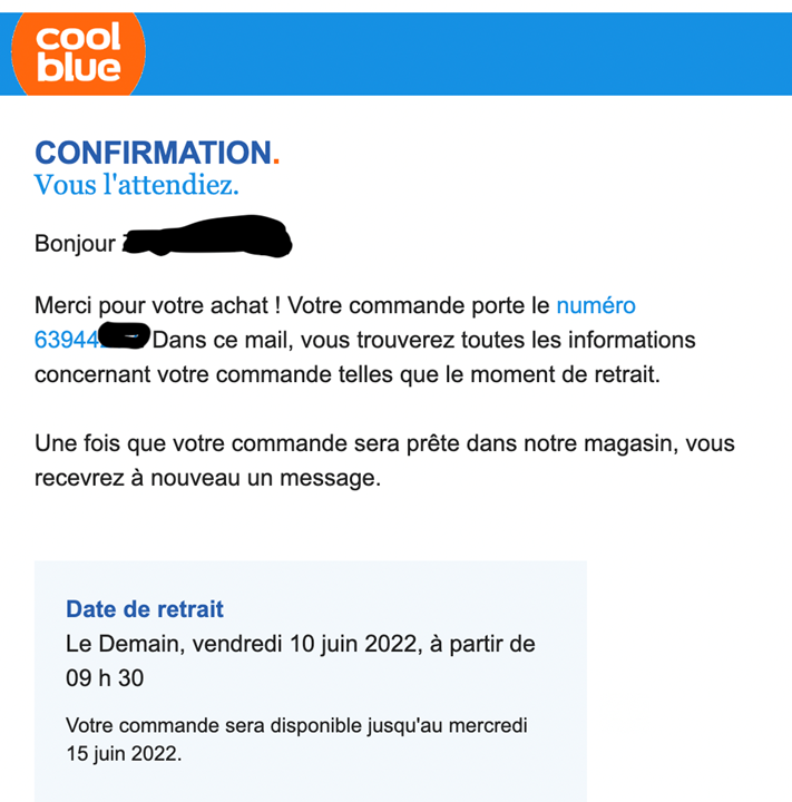
Cool Blue
Why is it (very) good?
The content is useful and clear and provides the necessary information with a touch of humour. The next step of the process is planned, and dates are clearly communicated. This copy is reassuring and perfectly on brand.

You were waiting for it.
Hello,
Thanks for your purchase! The number of your order 63944. In this mail, you will find all the information regarding you order, such as the pickup time. When your order is ready, you will receive another message.
Pickup date
Tomorrow, Friday 10 June 2022, as from 9h30.
Your order will be available until Wednesday 15 June.

Track your order on Mon Coolblue. Are you bit impatient? Why not enjoy our relaxation session ? (it’s a playlist of relaxing songs).
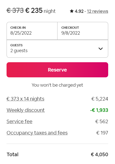
Airbnb
Why is it good?
Information is clear and useful, and the additional text under the CTA immediately removes a concern: even if you click on “Book” you’re not paying now.

Asana
Why is it good?
The magic link saves time and makes the app work for you with minimal effort. It’s respectful of the user’s time.

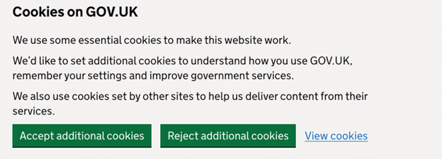
Gov.uk
Why is it good?
Content is extremely clear and accessible, taking the context into account, and focusing on the user’s priorities.


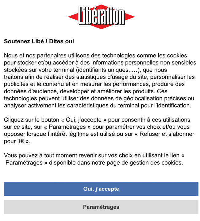
The cookie selection screen is clear and easy to understand, and not misleading. In comparison, this is a a cookie selection screen using a dark pattern:
Libération
What could be improved?
This media outlet pushes heavily on the “Yes” (Oui, j’accepte) by guilting the user. If the user selects “paramétrages” (Parameters), a second window appears with lots of toggle buttons. It doesn’t offer an easy option to select or decline cookies.


Why UX writing matters
Because people matter.
And people enjoy using apps and websites that get things done. UX writing helps your brand to build better and stronger relationships with users or clients and bring a human touch to the process.
Words matter.
Carefully researched and considered well written and tested copy will make a difference to the way people feel about your product of service. Without the right words, the experience provided by your carefully designed screen can crumble, frustrate users, and lessen their engagement and loyalty.
Our content design team will be happy to help you design and write awesome content for your digital content, so please get in touch with us! In our next article, we will look at our UX writing manifesto: what are the pillars of our practice and what is our methodology?


